Timeline
2 Months
Role
Lead Graphic Designer
Impact
CSU Receives + 300 Letters from Students in Solidarity
Team members
5 Members
Problem & Solution
COVID-19 impacted millions of students, disrupting their lifestyles and university experiences. In response, the Concordia Student Union (CSU) launched a powerful campaign to empower students with self-care guidance and distributed wellness boxes filled with goodies to promote solidarity and well-being.
My Impact
In Solidarity with Our Students and Team, We Achieved Results
As Lead Graphic Designer, I directed the creation of a powerful campaign that reassures students and delivers a concept with profound impact. This role deepened my leadership skills and fueled my research into mental health, enhancing my ability to convey our message effectively.
🗺️
Team Size
3 Members
✅
Creation Progress
0 to 1
Define Mental Health
Mental Health is defined differently by everyone
During COVID-19, mental health emerged as a critical global concern. Our research revealed that mental health cannot be encapsulated in a single definition; it is deeply personal and varies greatly from one individual to another, influenced by unique beliefs and values. Recognizing this complexity, we dedicated ourselves to brainstorming and developing an abstract, yet powerful and respectful representation of mental health. Our goal was to create an approach that resonated with the diverse experiences and perspectives of our audience, offering a nuanced and empathetic portrayal of mental well-being during these challenging times.
Designing The Product
Subtle but Fun. Inclusivity Comes First
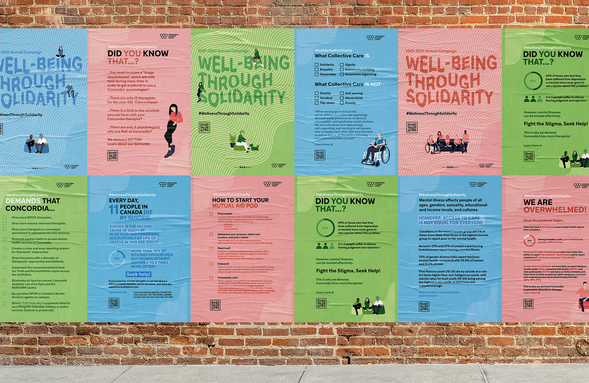
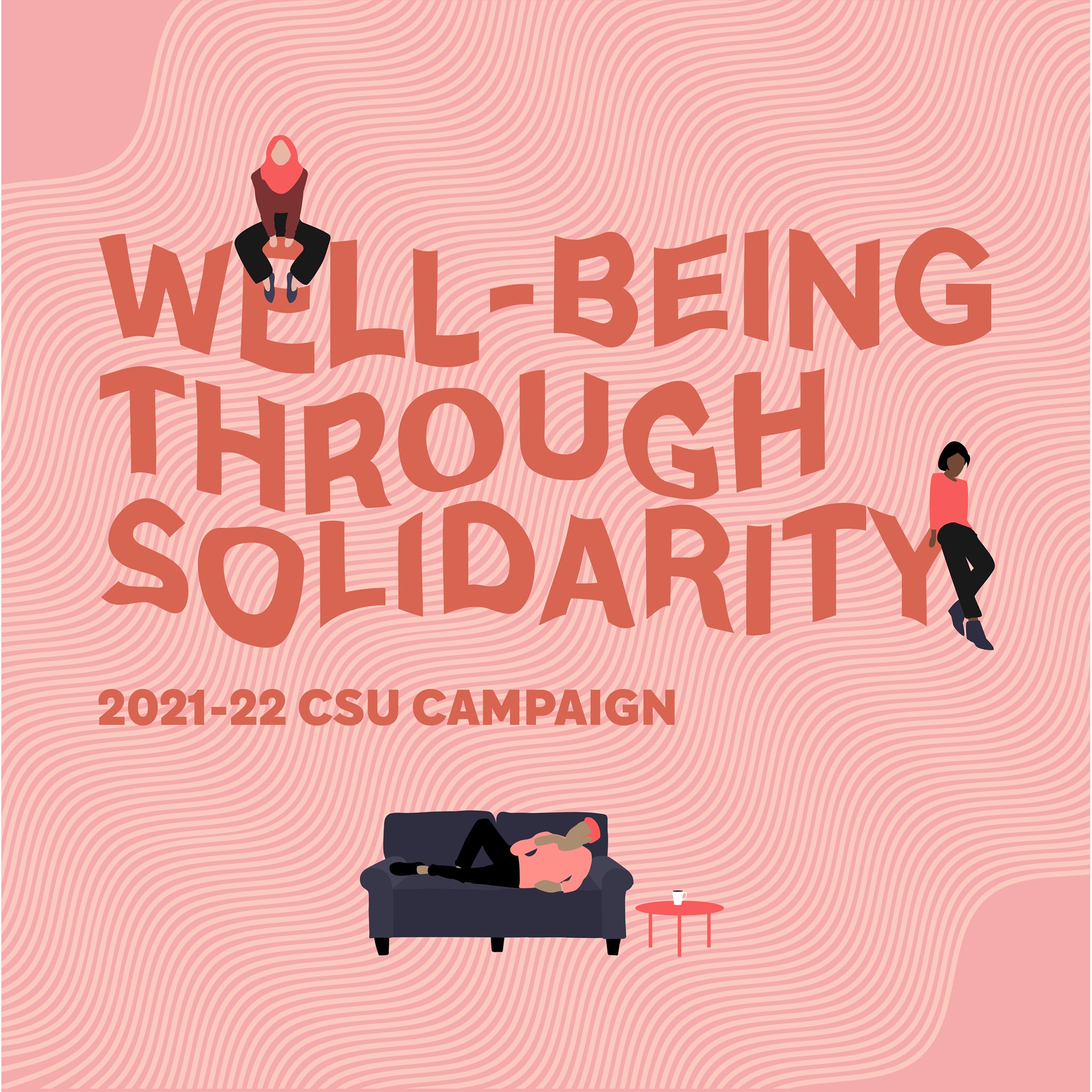
Expressing mental health through a subtle yet engaging and inclusive approach was essential to align with the minimalistic branding of the CSU. According to the CSU mission statement, inclusivity was a core value that needed to be reflected in every aspect of our campaign. To achieve this, we meticulously designed characters that shared the same fundamental features but varied in skin tones, hair styles, and clothing colors. This diversity was not only visually appealing but also symbolized our commitment to representing and embracing the rich variety of experiences and identities within our student body. By incorporating these elements, we aimed to create a campaign that was both fun and accessible, ensuring that every student felt seen, valued, and supported.
Mental Health in Different Colours and Shapes
Our color palette consisted of fundamental hues: red, blue, and green. We selected these colors because they are the building blocks of all colors, much like mental health is the foundation of one's well-being. The recurring wave patterns in our design symbolize the ever-changing nature of mental health. Just as waves rise and fall, mental health experiences fluctuate for everyone, capturing the idea that while each person's journey is unique, change is a constant.
A Wellness Box in the Name of Solidarity
To further empower our students, we sent wellness boxes filled with CSU-branded goodies, reinforcing our unwavering support throughout their mental health journey and reminding them that we are in this together.
We Unite, Not Quit. Even Online
While the world faced unprecedented challenges, our Design team tirelessly supported students virtually. Amidst this turmoil, we received hundreds of heartfelt letters from students, expressing gratitude or sharing their traumas. The CSU proved to be more than just a workplace; it became a family united in its mission to uplift students and spread the reassuring message that everything will be okay. This unwavering support and solidarity lifted the spirits of countless students during these difficult times.


