

Timeline
4 Weeks
Role
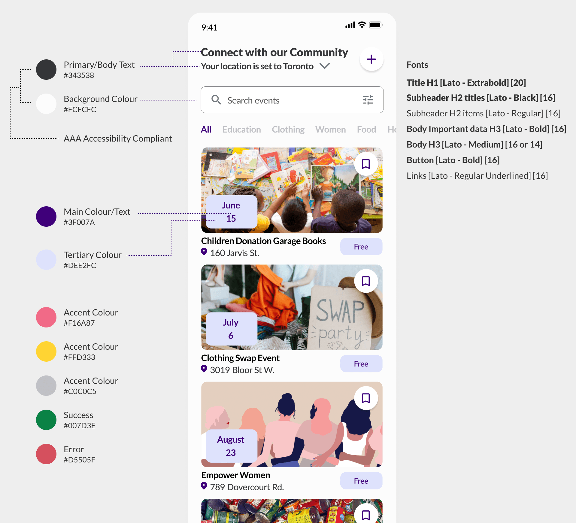
Product & Lead Visual
Impact
90% UXR Positive Feedback
Team members
4 Members
Problem & Opportunity
Donation Hurdles such as unclear guidance and cumbersome procedures makes young Canadians to not donate leading to overflows landfills

As the Product and Lead Visual, I focused on the "Book a Pick-Up," & "Create an Event flows from research and design to prototyping, usability testing, and presenting to stakeholders.


The Design Solution(s)
Metrics were calculated during two rounds of usability testing.
An efficient, user-friendly pick-up system for home donations would encourage frequent donations
🕰️
3 minutes
Schedule Pick-Up Completed
😄
90%
Testers found booking a pick-up quicker and more efficient, resulting in increased retention rates.
📈
60%
Increase in NPS (Net promoter score)
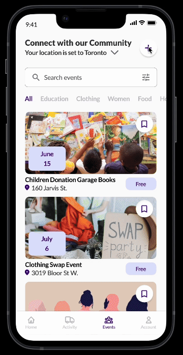
First Flow: Schedule a Pick-Up

A community page where people can create donation events would boost engagement and foster a cause-driven community
❤️
100%
Testers felt more connected and could create events.
🕰️
81% Users Felt
that reduced navigation time made them more engaged with their new community through the updated UI
Second Flow : Create an Event
Research Process
The Giving Report 2022 - 2023 helped us niche down on our user target: Millennials and GenZ
(22-50 years old)
Before interviewing people, it was crucial for us to understand the problem. Reading the “Giving Reports 2022 and 2023" by Canadahelp and many articles was an important step to know how to approach our audience.
We initially targeted all age groups but found this too broad. The Giving Report showed fewer donations from Gen Z and Millennials between 22 and 50 years old.


We compiled the results into a final Empathy Map. An Affinity Diagram was also made to group our ideas into categories identifying the focus of the project.

Designing The Product

With a tight 4-week deadline, I quickly iterated to address issues from our research and interviews by creating sketches, transforming them into low-fidelity prototypes and testing them with users for swift feedback.
Our research helped us understand that the reason as to why there’s this sudden decline among the GenZ and Millennials is because:
A) They do not know where or what to donate
B) The donation process is too confusing or time consuming (unmotivated or no time)
C) Does not feel like it resonates with them
Schedule a Pick-Up Iteration
Less Daily Clicks, More Engagement.
During the first round of feedback, users were frustrated with repeatedly selecting their donation center on the map, as it would likely be the same every time. To address this, I worked with another designer to include this step once during onboarding. Although it lengthened the onboarding process slightly, it reduced daily clicks and proved to be the best long-term solution.
As a result, 90% of testers found scheduling a pick-up easier and more efficient, leading to higher retention in the second testing phase.
Note: The final design begins at the third onboarding step, focusing on the "Schedule a Pick-Up" flow.
📦 Archived Design

✅ Final Design
Before
In Flow V1, scheduling a pick-up requires the user to select their donation center from the map each time. The area circled in red represents the part of the flow that users found frustrating during usability testing.

After
In the new “Schedule a pick-up” flow, users can select their donation center during onboarding or when booking a pick-up. The red part shows the added area, reducing daily clicks and increasing retention.

User Can Create an Event Through The Community Page
Spend Less Time Thinking, Connect More.
We identified several user interface issues: confusing UI, unnecessary distance info, small buttons, and an overwhelming "Create an Event" form. Users also wanted to select their event viewing location and found shadows distracting.
After feedback and iterations, we revamped the community page. Users can now see accurate event dates, set their location directly, and use simplified forms with a progress bar, improving usability and satisfaction.
User interviews and analysis led to a more user-friendly interface. Initially, only 3 out of 11 testers wanted to create an event, but after improvements, 9 out of 11 were interested.

Our Initiative Led to a Potential Expansion in the Future.
Our decisions were guided by ongoing iterations and user feedback. With more time, re-validating changes after additional feedback would ensure Multiply better meets user needs.
This project shows promise in addressing key issues in donations and communities. However, to fully resolve these challenges, Multiply needs a larger team and a robust business proposal to handle logistics and security.