Timeline
4 Months
Role
Product & Lead Visual
Impact
Free Curated Education for Nigerian and Kenyan Children
Team members
4-8 Members
Problem & Solution
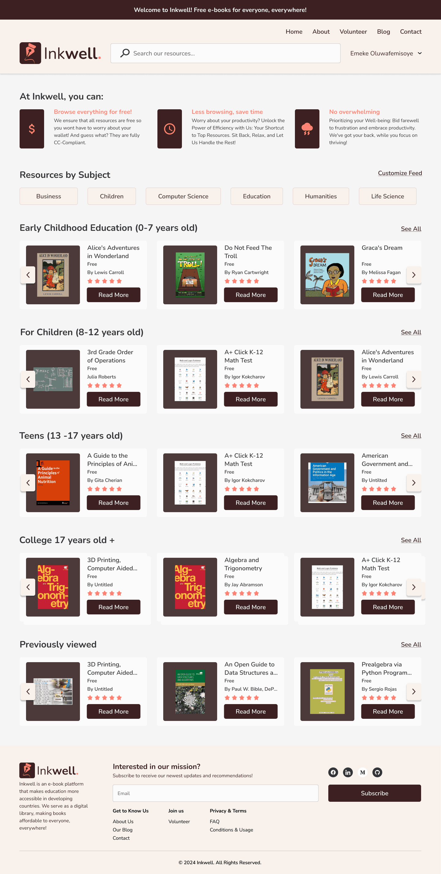
59 million children lack access to quality education due to limited resources and funding. Inkwell addresses this crisis with a user-friendly MVP site that centralizes curated resources and offers personalized homepage feeds, prioritizing comfort, accessibility, and ease of use.
My Impact
Collaborating and Teaching Became Everything.
🗺️
Team Size
4-8 Members
✅
Product Progress
🚀
Audience Exposure
Helping Children to Succeed
🥳
Testing Usability
Working Within Constraints
Targeting an International Audience in Africa with Low Internet Bandwidth was a Huge Challenge.
Reaching the audience in Nigeria and Kenya was challenging due to limited internet bandwidth, making user interviews difficult. To compensate, we sent surveys to locals and 50 nonprofit organizations and schools, receiving 20 responses. Occasionally, Inkwell welcomed individuals from these countries to the development team, allowing the product team to interview them and their families to better understand the needs of our user audience, which includes children and adults from kindergarten to university.

Bandwith in Nigeria

Bandwith in Kenya
User surveys, interviews, and online research clarified our main focus:
A) A way to provide users with resources relevant to their own needs.
B) A way for users to comfortably filter through books to find the one needed.
C) A way for users to make them feel at home, and create a study space where they can find everything in one place.
“I need everything in one place. Its too much to find everything on my own through Google”.
-Shan
“I wish to put extra hours in my studies outside of my curriculum, but don't know where to start”.
-Jane & Oliver
“I feel overwhelmed, when I can’t find relevant content to my own needs”.
-Sam
Designing The Product
Speed Became Essential: Here's How We Managed:
With only a few months and communication constraints, our globally dispersed team focused on rapid iteration and multiple design concepts. We organized a competition for designers to create sketches, which were then merged into an initial draft for feedback. Throughout brainstorming, wireframing, and development, I led weekly meetings with the Product Manager and the rest of the team to update progress and assess design feasibility. The design team focused on layouts, while the development team concentrated on building the back-end.
The Power of Repeated Iteration
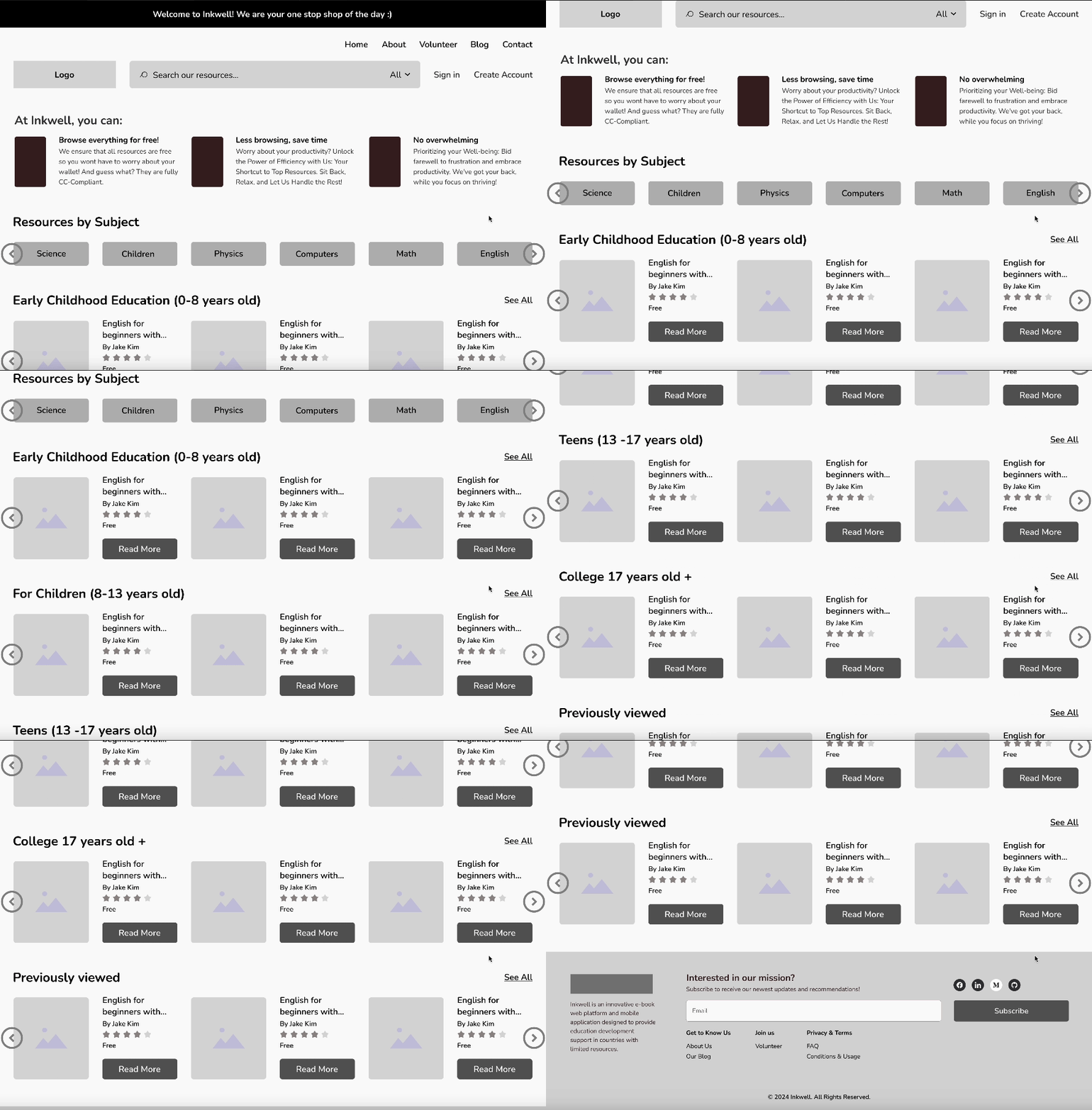
I gathered the team remotely, and we started sketching ideas for the landing page. Since we were in different time zones, we focused on simple sketches rather than detailed wireframes. This method helped us create our semi-final homepage design.
📦 One of Many Archived Designs
✅ Final Semi Design
=
✅ Homepage Wireframe
Feature Iteration - 3 birds with one stone
Get to What Matters Faster with Customized Feed
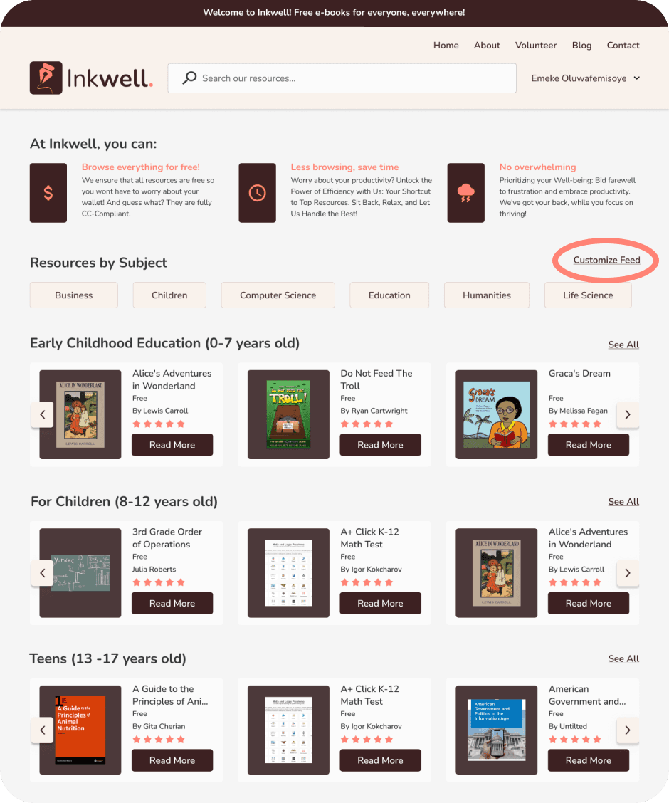
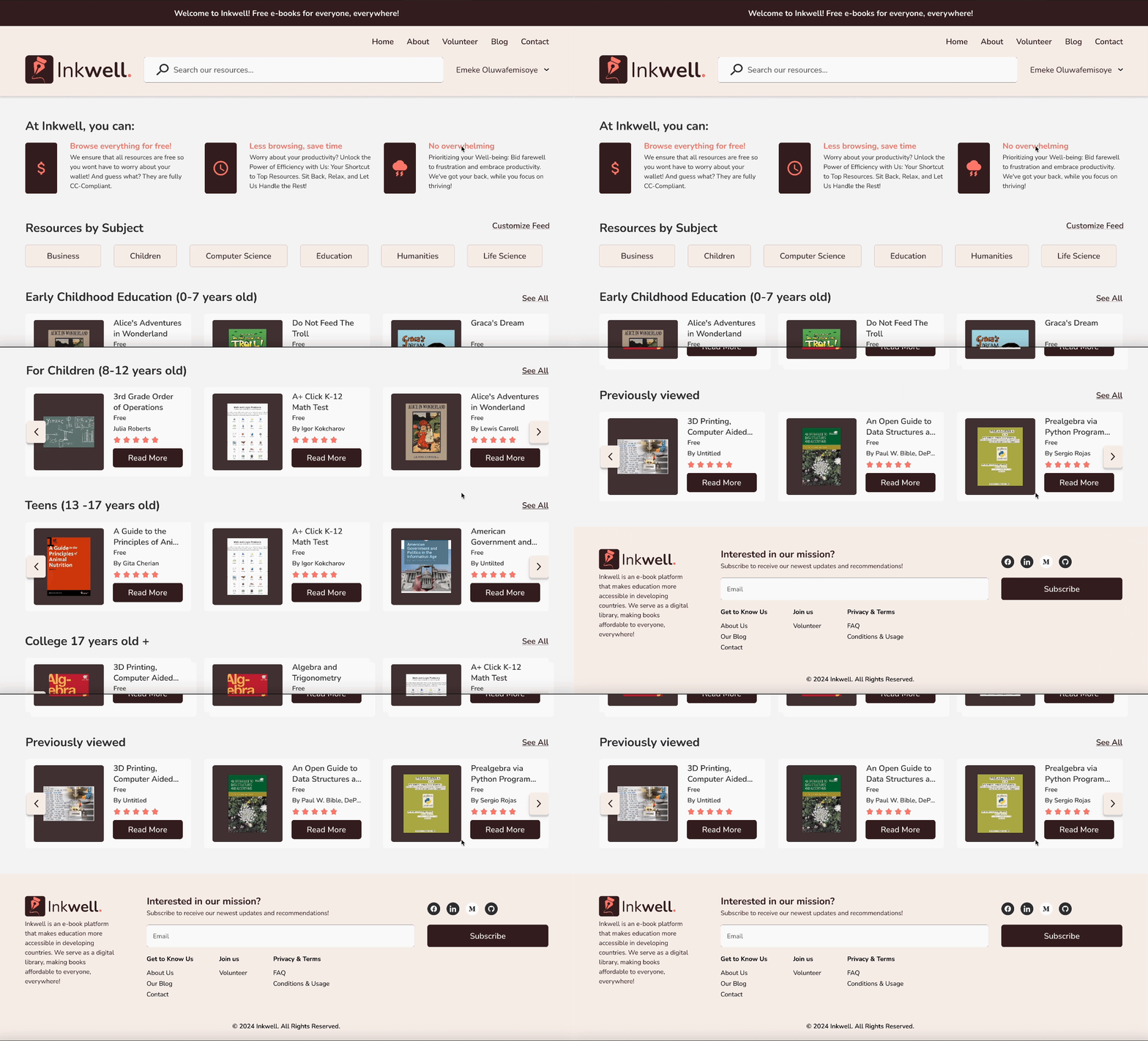
Through multiple iterations, we brainstormed ways to help users find relevant content faster, a key selling point of Inkwell. The customized feed option, which is based on a quiz that asks users their age and subject preferences, allows them to personalize their homepage, giving them access to resources tailored to their needs in one place. Initially, we placed this option under 'Settings' on the 'Profile' page, but user testing revealed that this was cumbersome. By moving the 'Customize Feed' button directly to the homepage, user satisfaction and retention doubled, as it made the customization process more accessible and straightforward.
Flow of The Customize Feed Feature
Refining During Usability Testing
Balanced Design,
Better Focus
During usability testing, many users struggled to focus on specific resources in the carousel. To address this, we added a subtle, non-white box beneath each item to enhance focus and visual appeal. Additionally, we improved the arrows by adding shadows to make them stand out, ensuring they remain visible at all times. This ensures the carousel is clearly distinguishable from a static set of images, enhancing user experience and interaction.
The White Box Around The Resources
📦 Archived Design
✅ Final Design
The Carousel Arrows
📦 Archived Design
✅ Final Design
Accessibiliy
User First, Accessibility First
With a team of over 10 members, Inkwell required a robust design system for efficient collaboration between designers and programmers. Our components are user-friendly, allowing designers to easily delete, merge, or add parts.
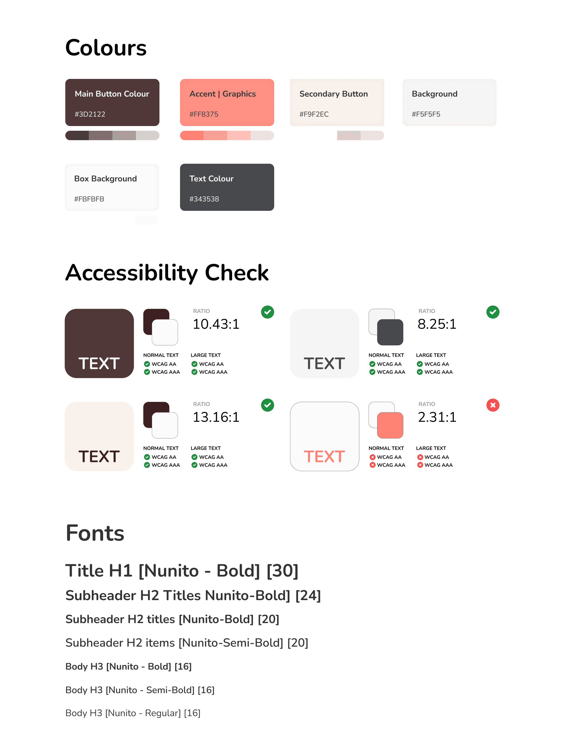
Inkwell features a carefully selected color palette verified for color blindness. We used simulations to ensure our brand is aesthetic and functional for everyone, concluding that zen/earthy colors create a calm, trustworthy atmosphere. Balanced contrast ensures AAA+ accessibility.
We chose the Nunito font for its simplicity, warmth, and compatibility across platforms, enhancing accessibility with its friendly roundness.
Next Steps
So,
What are the Takeways?
Building Inkwell from the ground up with a dedicated team of designers, managers, and developers was an incredible experience. This website, offering free educational resources to students in Nigeria and Kenya, represents more than just a platform; it’s an initiative poised to unlock countless future opportunities. Our next big step is to assess whether Inkwell is truly helping children and how we can improve it.

