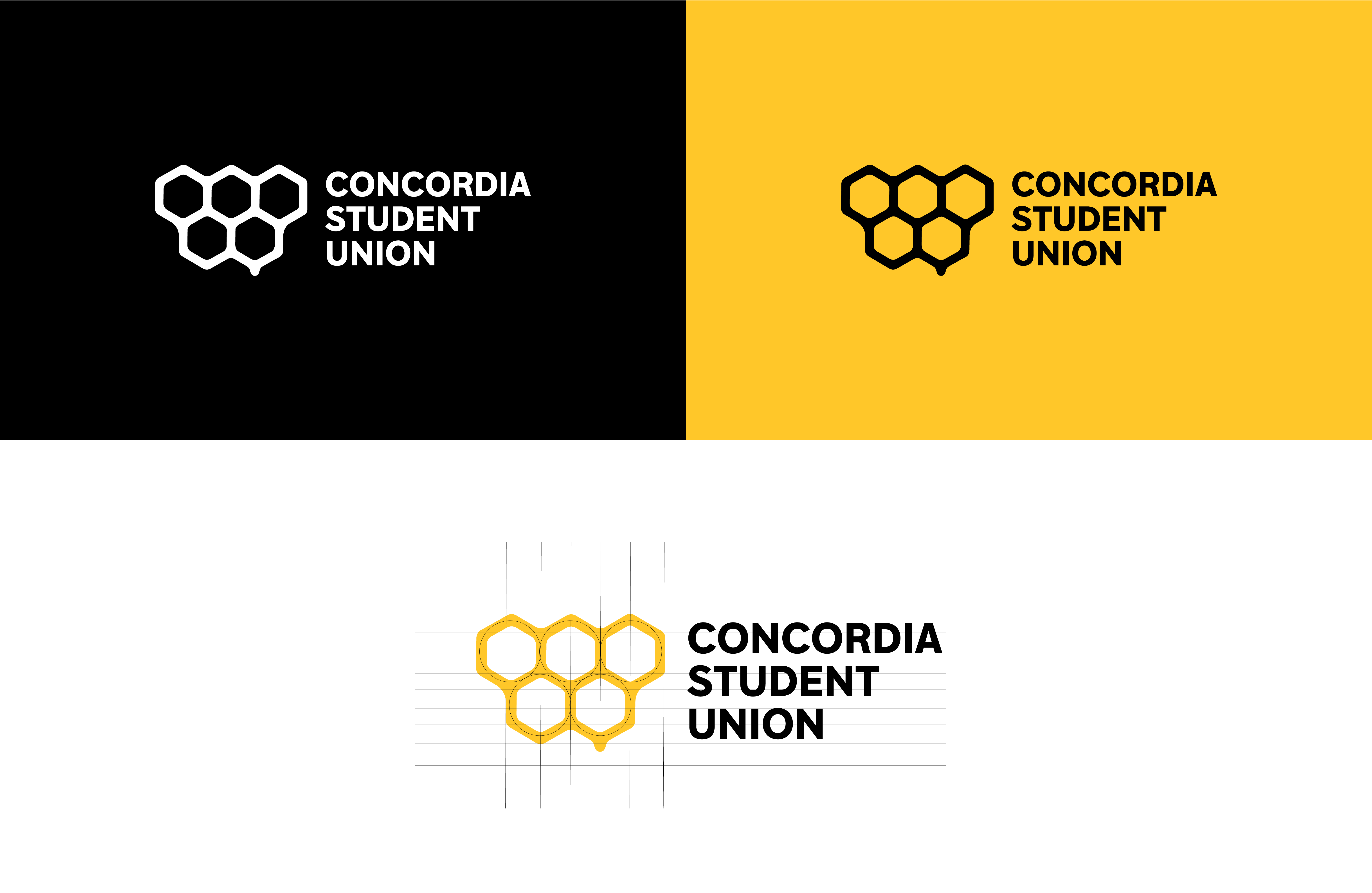
The Concordia Student Union’s message is to serve students, defend their rights, and act as the highest representative student body within Concordia University. The 2019-20 Student Union executives voted to do a full rebranding of the association, including the union’s main website. Their vision was to bring the four faculties together by creating a brand identity that portrays togetherness, connection, and community.
The five honeycombs represent the four faculties and CSU standing united as a community with the gold colour bringing friendliness and an open-minded vibe to the association's identity. The typeface of the logo consists of a modern font called Guillion that has a clean and modern feel.


